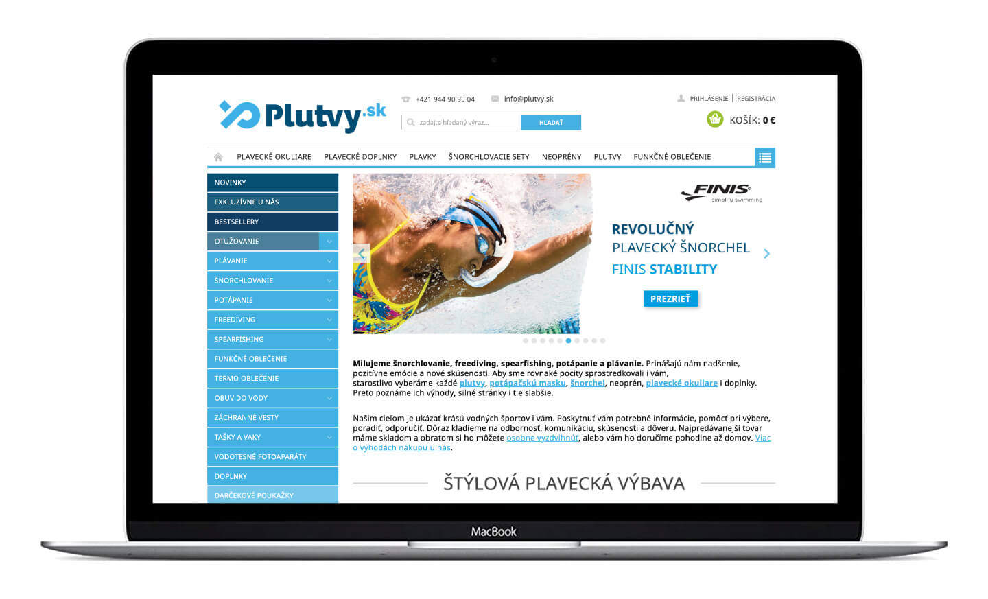
Plutvy.sk is an online store focused on water sports equipment. They are based in Bratislava – Slovakia.
They love snorkeling, freediving, spearfishing, diving, and swimming. Their goal is to show the beauty of water sports by not only providing the necessary information and help but also giving advice and recommendation.
The company has been on the market for almost a decade. During that time, the corporate culture and image changed dramatically; therefore, the original logo and branding no longer met modern requirements.
My task was to redesign the original logo and define their modernized brand and come up with something modern, fresh and representative. The logo had to contain all of these attributes and express its corporate culture.
Scope of the project
Company logo / Slogan / Corporate letterhead, envelope and business cards / Stationery / Gift vouchers / Stickers / Corporate t-shirts / Packaging tapes / Corporate vehicle / Style guide / Product photography & Styling
Tools I used
Pencil sketching / Wacom Intuous pen tablet / Adobe Illustrator & Adobe Photoshop / Canon 6D MkII / Ricoh GR
Brainstorming ideas on the task to design a logo for a water sports business, most people would imagine something connected with water, fins, or other similar elements. It is a natural and very quick association. This approach had also been followed in the previous version of the logo – presented with a simple stroke image featuring a fin at the end of the logo.
However, keen on getting fresh stuff that would distinguish the company from the competitors, I stepped aside from the traditional associations and tried other creative directions. I wanted it to be more dynamic. I believe that a logo should identify a brand, not explain, therefore I was not looking for something that would be immediately connected with water.
Because Plutvy.sk is a well-known company that has already won its audience on the market, every design change was done concerning the company’s history and philosophy as well as the brand image that has grown through the years. Therefore, the new design had to take its roots from the existing branding, but offer some refreshment and add some trends.
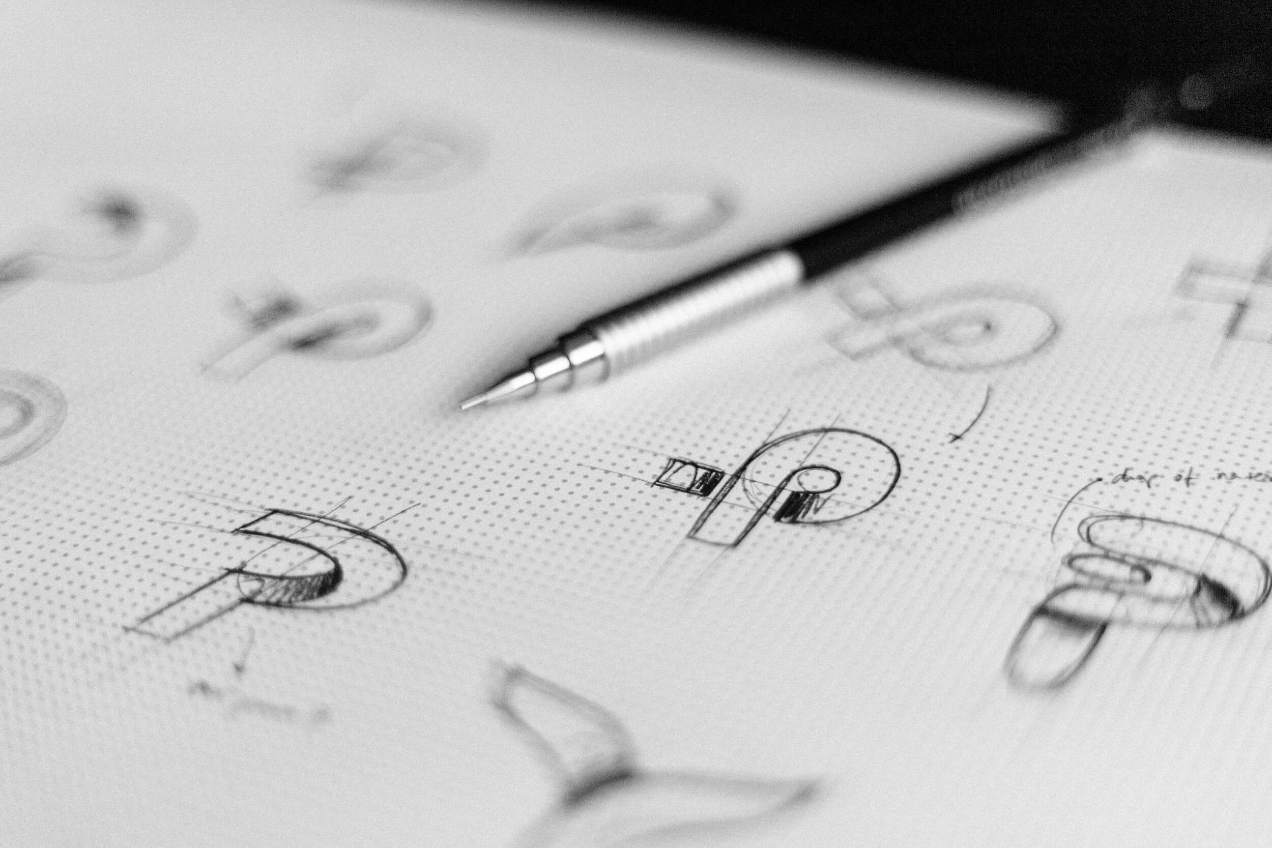
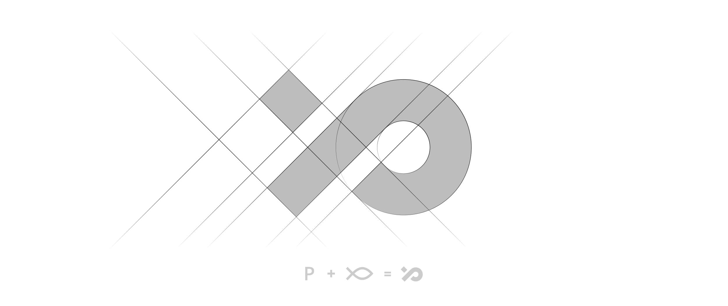
Moving away from ideas and patterns typical for water sports logo design I was able to find something different. As I explored concepts and got deeper, the image of a ribbon emerged. The implementation of the ribbon as the initial letter of the company name (P) and at the same time representation of a fish expresses all of the ideas and ties them together.
Finding the right typography to complete the logomark is essential to creating a strong brand.
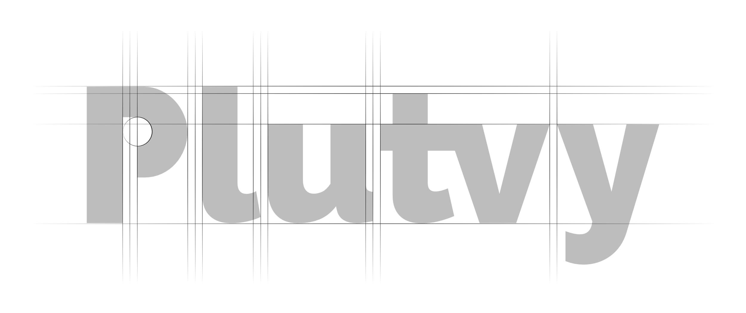
After finding the best typography, it was time to clean it – and polish it to get a sophisticated and elegant silhouette. The solution for the lettering part was focused on readability on different applications and sizes.


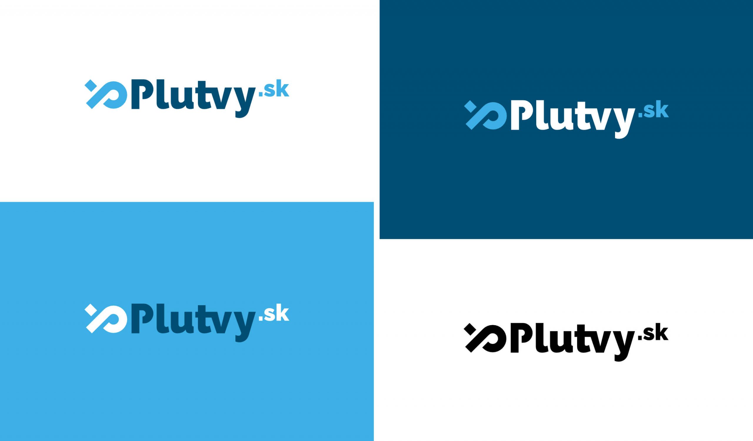
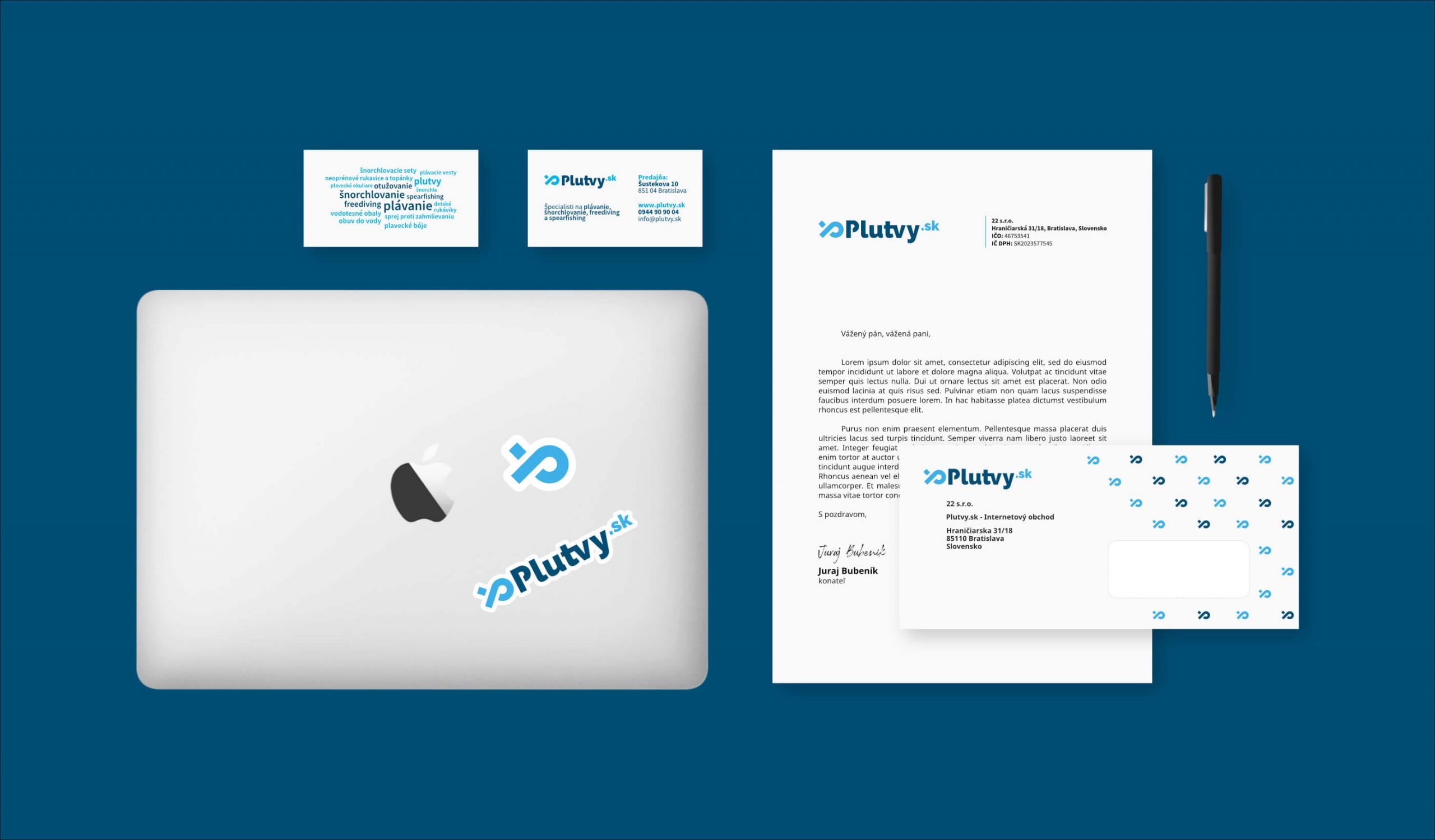
Next, I prepared a set of templates for company documents, including business cards, letterhead, and envelopes, that reflect the brand identity in a simple, non-distracting way.
Another object of the design effort was a brand sticker. Now stylish and catchy stickers have become a popular and quick way of spreading the word about the business and strengthening brand awareness.
Two sticker options were created for this purpose: one featured only the letter mark while the other showed the full version of the logo.
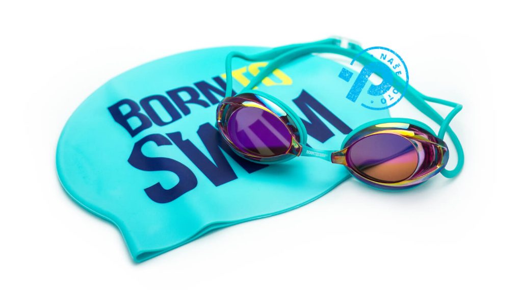
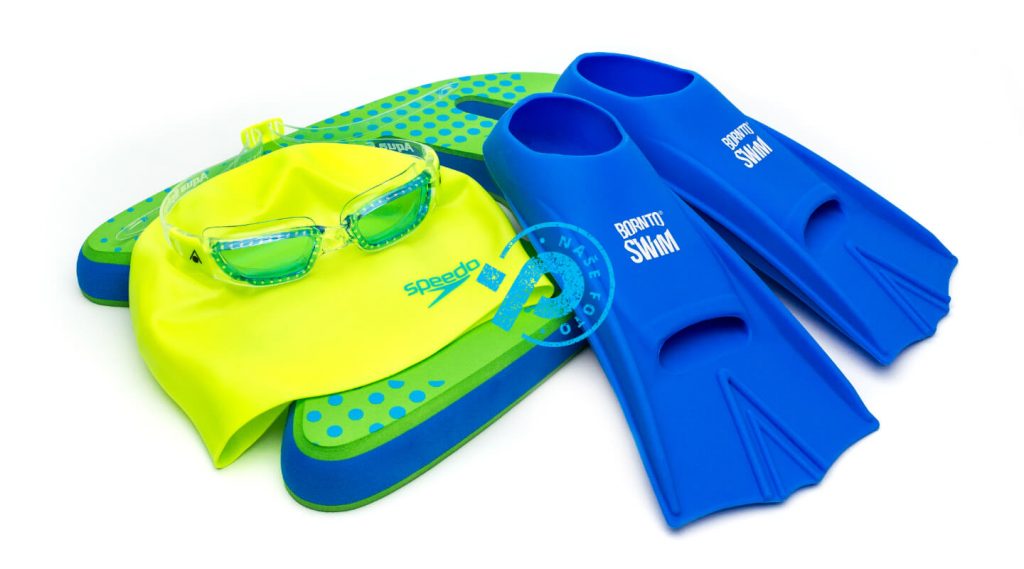
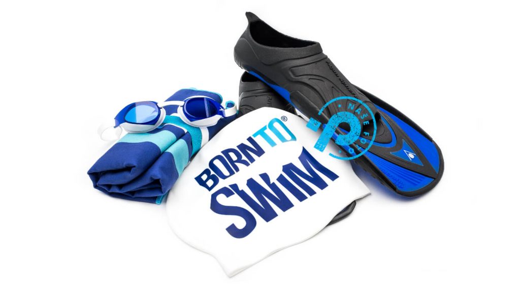
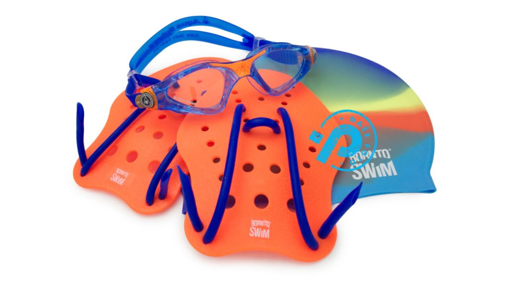
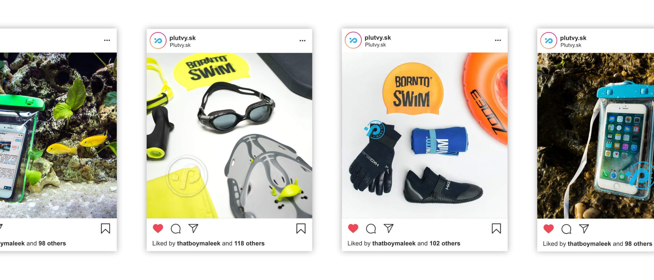
After finishing the logo, stationery, and other branding items, I was asked to design a branded watermark and photograph their products.
The reason being, as I mentioned in the client’s brief, Plutvy.sk runs an e-shop. They offer a whole range of equipment for different watersports. They need to present the products in the best way possible.
So I created a set of four watermarks, each defining a different aspect of the product. The design was done with a precise focus on the logo design and corresponded with the branding.
Say Hello
I’d like to hear from you.
Are you interested in learning more about my services and working with me? As I work full-time at Sufio, my freelance availability is rather limited. Still, I am eager to hear about new ideas or what you are working on.
